Grouped View
The GroupedView element is now available as a child element of the RenderStyle element within the ListBuilder element on page specs. It allows users to display the rows in list builders as groups with shared headers based on column values.
As part of this new feature for list builders, you can now use Design Mode to select the columns that are available for grouping.
On the page with the list builder, toggle Design Mode on and click Properties above the list. In the List builder section of the Edit page section screen, you can now select "GroupedView" in the Style field to use the grouped view render style. This exposes the Groups and DefaultSortOrder fields.
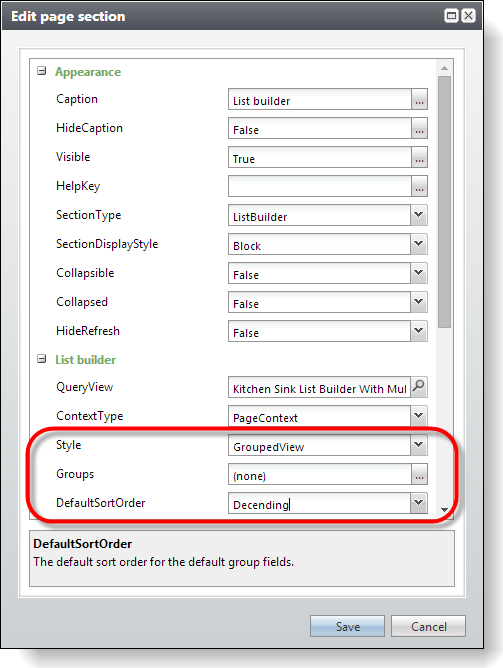
To select the columns that are eligible for grouping, click the icon in the Groups field. The Groups screen appears.
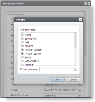
The Available fields box displays the list of the fields that correspond to the columns in the list builder. To make a column eligible for grouping, select its checkbox in the list. When users sort a list based on one of the columns you select here, the list is organized into groups under collapsible headers based on the values in that column.
To designate a default column for grouping, select it in the Default grouping field. When you select a default column for grouping, the list is organized into groups based on that column when users first access the list.
To return to the Edit page section screen, click OK. In the DefaultSortOrder field, you can select whether to display groups a list in ascending or descending order by default.
Tip: For more information about the GroupedView element, see Organize Lists into Groups.