Report Sample
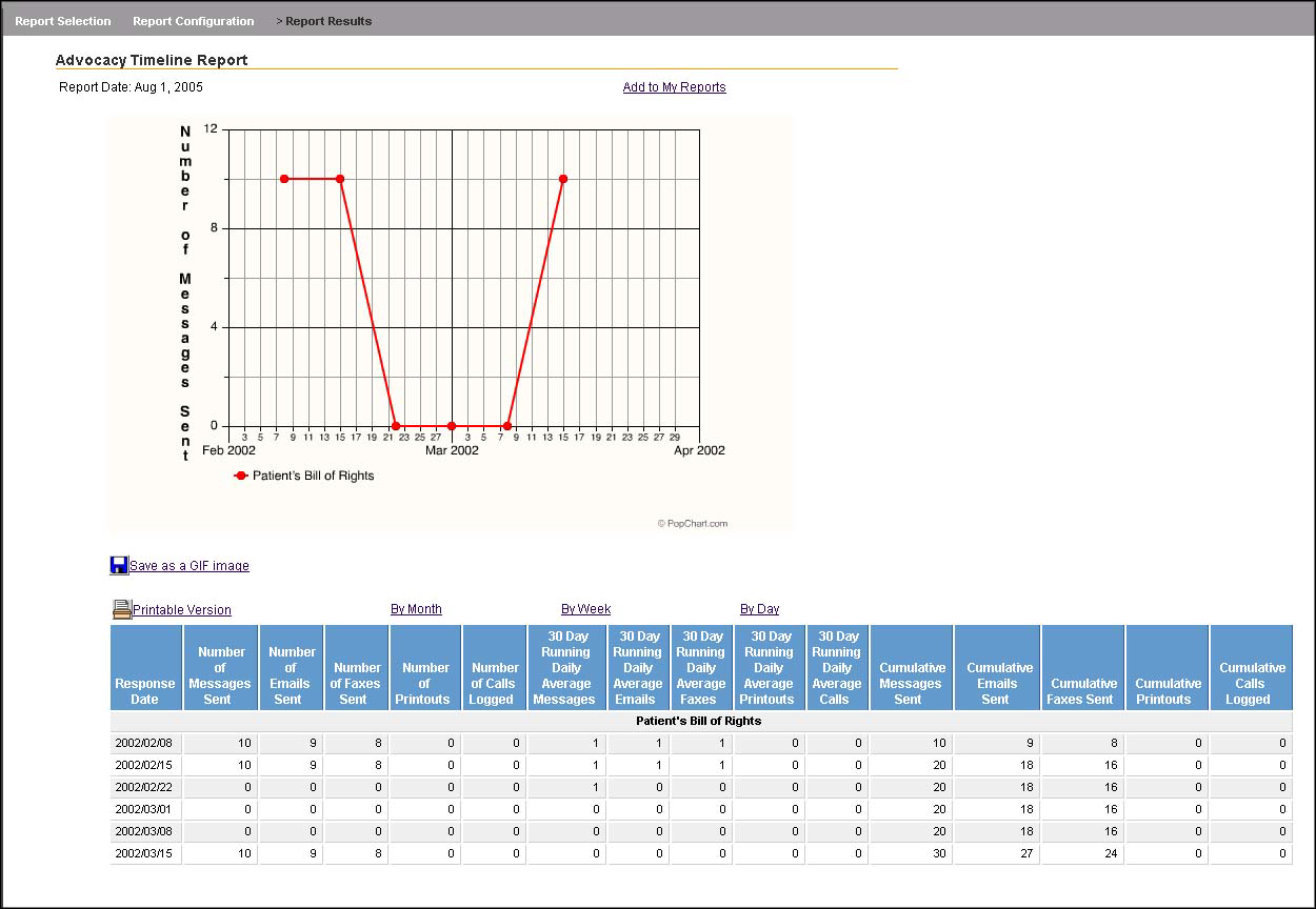
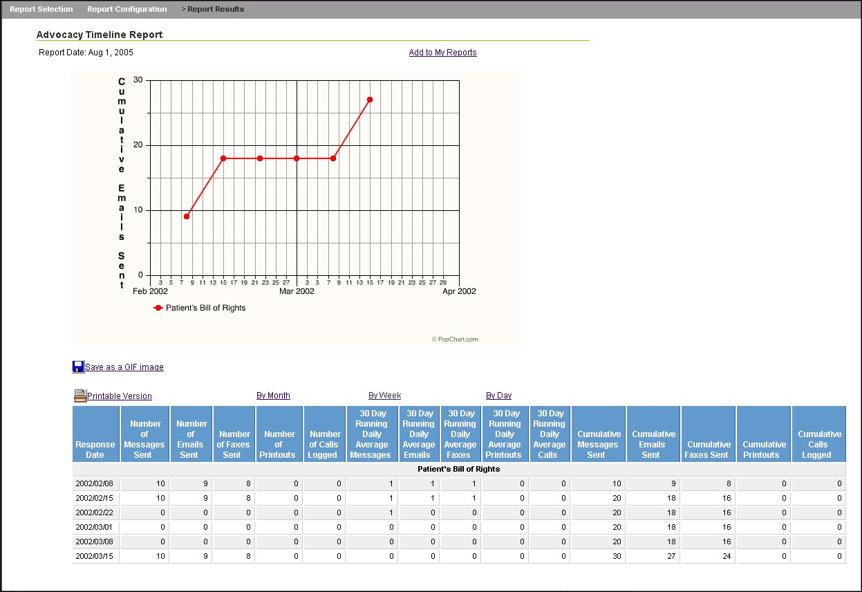
The two sample reports shown below illustrate how the same advocacy data can be viewed in two different ways by clicking on the headings in the Advocacy Timeline Report.
The first Advocacy Timeline Report shown reports on just one alert and shows a graph of the Number of Messages Sent weekly for a specific two-month period of time.

The second Advocacy Timeline Report uses the same report but graphs the Cumulative Emails Sent, again weekly during a specific two-month period.
