Campaign Giving Breakdown
PremiumVisualize how your campaigns compare when it comes to total giving. If you have a Premium subscription, this prompt returns a bar chart of received revenue for each campaign over the last fiscal year, so you can quickly spot your strongest performers and inform your planning. If you don't have a Premium subscription, this prompt will still work and return the same insights but in a list format.
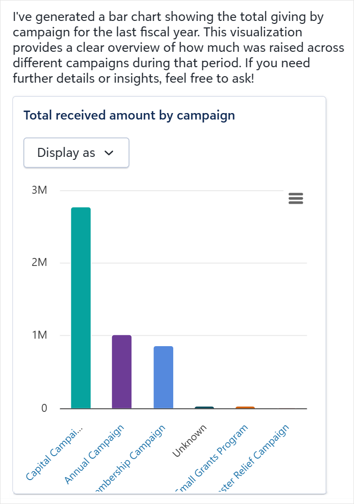
The chart groups all gift records by campaign and sums the total received revenue for each one. By default, it surfaces up to 10 campaigns, but you can ask for a specific number: "Show me a bar chart of total giving by the top 5 campaigns for the last fiscal year." If your organization uses a non-calendar fiscal year and the result looks off, try specifying exact dates instead: "... from July 1, 2024 to June 30, 2025."
To dig deeper after viewing the chart, follow up with a question like "Show me the top donors to [Campaign Name]" to see who drove giving to a specific campaign.
![]() Tip: If you're viewing a specific fund record, add "for [Fund Name]" to see how campaigns compare on giving to that fund, giving you a campaign-level breakdown within a single designation.
Tip: If you're viewing a specific fund record, add "for [Fund Name]" to see how campaigns compare on giving to that fund, giving you a campaign-level breakdown within a single designation.
Prompt
|
Show me a bar chart of total giving by campaign for the last fiscal year. |
Sample Response