Photos
Use the photos content type to enable images to appear as a list of thumbnail images, as a stand alone photo, multiple photos in a Gallery (with next/previous buttons or in a flash player), or multiple photos stacked vertically.
-
Select Core or School website.
-
Select, Content.
-
Select Media.
-
Select Photos.
Photo categories (also known as "albums") are used to store and organize image files.First create categories, then Add new content to the category.
Refer to Error Messages Using Bulk Upload Tool .
Refer to An overview of user profile photos (avatars) and how to upload profile photos in bulk.
You can add photos to a variety of content types (including text, news, links and lists). The options outlined on this page are applicable to all photos, regardless of which content type you are using. When previewing uploaded photos, use Next photo to Previous photo to scroll through each one.
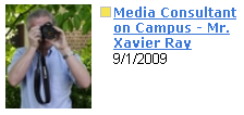
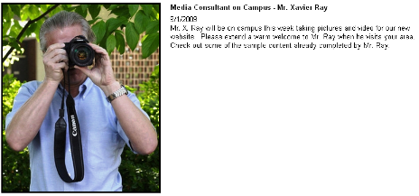
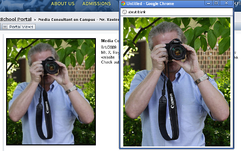
Each photo you upload can have three versions: thumb, standard and zoom. These sizes are applied when an image is downloaded by a user, rather than when a photo is added to a web page.
Depending on how you display the photos, you may or may not need all three versions. Select the options you need when creating the content category.
Uploaded photos are stored at their original size, but can be re-sized from an album, which affects the size of the image when added to a web page. When an image is initially uploaded, users can select the thumbnail in the modal to see a preview of its actual size and orientation.
When uploading the photo, you must upload the largest-sized photo (for example, if you are using the zoom option, upload a photo that is 800 x 800 px instead of a photo that is 200 px x 200 px). The system will then automatically create the standard-sized and thumb-sized photos. If multiple photos have been added to a category, select Next photo to advance through the slideshow and Previous photo to move back.
-
Thumb view
-
Standard view
-
Zoom view
School Website System has its own default dimensions for the thumb, standard and zoom versions of a photo:
-
Thumbnail: 80 x 80 pixels Max 240 x 240 pixels
-
Standard: 320 x 320 pixels Max 960 x 960 pixels
-
Zoom: 800 x 800 pixels Max 2400 x 2400 pixels
The maximum size allowed for all images is 2400 x 2400 pixels.
These maximum dimensions are applied when users download photos which were uploaded to this album, unless you override them by entering a custom max width and max height in the photo category. Your photo dimensions will vary, depending on where the photos are going to appear on your site (in a sidebar, on the homepage, in the embedded flash player, etc). A support representative will provide you with your Site Specs document which will contain the exact photo dimensions for your site.
For example, let’s say you need to add a photo to the sidebar of a page, which is only 190px wide. If space allows, the image appears the size it was uploaded (or the size it was edited to). Otherwise, it's re-sized to fit the smaller space requirements (and may be deleted entirely.) Your photo will not appear wider than 190px, and fits in the sidebar.
These maximum dimensions will automatically be applied to the photos you upload,
Even if you enter a custom max width and height, it is still recommended that you crop your images to the correct dimension and save them for the web to ensure that you get the best quality and file size.
The system will maintain the aspect ratio of your photos.
Based on how you set up each audio category or album, you'll be prompted to complete these fields.
-
Include album description for photo items -This setting enables you to enter a long description when creating a photo album. If this option is not checked, any photo album created within this category will not have a long description text box. Descriptions enable you to enter more text and can be viewed on a detail page.
-
Allow titles on images - Select this to enable content managers to edit the title of images. If not selected, titles are automatically entered based on the photo file name.
-
Allow captions on images - Select this to enable content editors to enter captions for photos. Captions are limited to 1600 characters and can't be formatted with the HTML editor. However HTML tags are allowed in the caption box.
-
Allow descriptions on images - Select this to enable content editors to enter descriptions for photos. Descriptions do not have a character limit and you can format them with the HTML editor.
-
Photo size information - By default, the "standard" size is selected. You can change this and enter your own max width and height. To do so, select which size you want to change (standard view, zoom, thumbnail) and then enter new maximum dimensions.
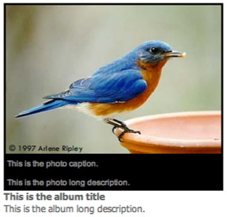
The placement of the captions and descriptions depends on your photo display format and channel options.
-
Title - The title of the album may or may not appear depending on the channel and display options you set.
-
Allow users to download images - If selected, users will the have the ability to download images from the album. The download option may or may not appear depending on the channel and display options you set.
-
Featured - If selected, this album will have a "featured" label in the Media Gallery and on pages. The featured label may or may not appear depending on the channel and display options you set.
-
Long description - Use this to describe all the photos in the album. The long description may or may not appear depending on the channel and display options you set.
-
Basic upload - Use this if you have fewer than 5 images. Once you have chosen the photos to upload, you must click the upload button located under the photo selections.
-
Bulk upload - This feature opens a java box allowing you to upload multiple images, up to 1 gb, at once.
-
Organize - After you have photos in the album, you can drag and drop the photos to resort them.
-
Batch edit
-
Bulk Tag - Tags entered here will be attached to all photos for search purposes. Tags are neither Alt or Meta tags used for SEO.
-
Edit Sort Order - The sort order determines the order in which photos are shown.
-
Titles - If you do not want to use the file name as the photo title, you can enter a new title. The title will appear depending on your display and channel options.
-
Captions - Captions will display with the photo depending on the display and channel options.
-
Tags - Tags entered here will be attached to the individual photo for search purposes.
-
Descriptions - Descriptions will appear with the photo depending on the display and channel options.
-
Album Cover - Using certain display formats, a thumb image of one photo will display as the album cover. By default the first photo is the album cover, but you can select any photo using the radio button.
-
Delete on Save - This allows you to remove individual photos from the album.
-
-
Publish to locations - This allows you to publish the news story to multiple locations. This is useful if you would like to make sure this article is published to categories that are on other pages as well as any type of group pages you want to publish to. Choose the locations you want to publish to by using the arrows.
-
Publish and expire dates - This allows you to set publish and expire dates. The publish field must be populated and will not default to today's date. You can set this date for the day you are creating it or in the future.
If the album is published to multiple locations, you need to set a publish and expire date for each location the album is published to.
-
Number of items to show - Use this option to determine how many albums you want to appear in a channel.
-
Archive/more link - Allow users to view all albums in the category.
-
Archive/more link text - Use this option if you want to customize the text for the archive/more link. By default it shows as "More Albums."
-
Display format
-
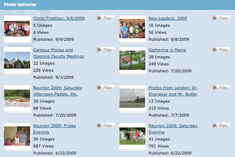
The Gallery View format is ideal for showing multiple albums on a page, especially of candid photos. Users can select through the individual album photos or select Play to view the photos in a slideshow.
-
List view is ideal for showing multiple albums on a page. Users can select through the individual album photos or select Play to view the photos in a slideshow.

-
Thumbnail View is ideal for showing multiple albums on a page. Users can select through the individual album photos or select Play to view the photos in a slideshow.

-
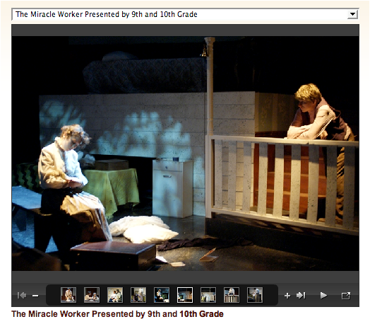
The Embedded Flash Player shows photos in a click-through or rotating gallery. This format is useful for showcase photos (such as for a campus tour) or for candid photos. When adding the Embedded Flash Player to a page, it will automatically resize itself to fit in the page column (or you can enter a custom width and height under Channel Options > Embedded Players). The photos will also automatically be centered in the player. Because of this, it is not as important that all the photos are cropped to the same dimensions.
-
HTML5 Player - Photos
There are several different options for displaying photos with the HTML player. To set these options, go to the channel options and select the Embedded Player (HTML) tab.
-
Display a single photo - This setting is ideal for showing a single photo in a sidebar.

-
Display stacked photos - You can also stack multiple photos in the sidebar of a page using the embedded HTML player.

-
Display photos in an HTML gallery - Multiple photos can be shown in a click-through or rotating HTML gallery.

-
Both the flash and HTML player share the same set of basic settings for sharing audios. To edit these settings, go to the Embedded Players tab in the channel options.
-
Embedded player appearance - Use this to set a custom width and height of the player.
-
Show album date - Use this to show the album publish date.
-
Show album title - Use this to show the album title.
-
Show long description - Use this to show the long description.
-
Alignment - Controls the alignment of the Audio files within the player.
-
Multiple item selector type - You can choose to show multiple albums either as links or as a dropdown box.
There are several different options for displaying photos with the Embedded Flash player. To set these options, go to the channel options and select the Embedded Player (Flash) tab.
-
Player Appearance: Border - select visible to include a black border around the player.
-
Captions: Position - choose the caption position, either bottom or top.
-
Captions: Appearance - choose from the list.
-
Overlay on Rollover - Captions will only appear when a user rolls over the image.
-
Hidden- Captions will be permanently hidden.
-
Fixed - Captions will appear visible at all times.
-
-
Navigation: Position - choose either top or bottom, this is where the navigation buttons will display.
-
Navigation: Appearance - choose from the list.
-
Hidden - the navigation bar is removed from the slideshow.
-
Alwaysvisible - the navigation bar is visible when the gallery is both open and closed.
-
Visible on rollover - the navigation will only appear when a user rolls over the image.
-
-
Navigation: Link Appearance
-
Thumbnails - all images in the album will appear as thumbnails in the navigation.
-
Numbers - all images will appear as a number in the navigation.
-
-
Navigation: Link Preview Appearance- If visible, the player will show a link for other images in the album, if hidden they will not display.
There are several different options for displaying photos with the HTML player. To set these options, go to the channel options and select the Embedded Player (HTML) tab.
-
Multiple Item Display Mode -
-
Stacked - Show photos from one album in a vertical film strip format.
-
Single item with selector -Show one album on the page, however, other albums from the category can be selected via a dropdown menu or link. To choose dropdown menu or link, go to the Embedded Player tab in the channel options and choose the multiple item selector type.
-
-
Slideshow
Use this to have photos automatically rotate in the gallery. -
Slideshow Buttons
Use this to include or hide the navigation buttons (back/next) in the gallery. -
Style
If you have multiple gallery styles, choose the desired one.
-
When previewing a photo, you have access to a few editing and management tools.
-
Resize - This can dynamically alter the default size of the image. A slider can be dragged ranging from the default upload size to the smallest possible size.
You can only decrease the original size of the image. This is to prevent increasing the photo size beyond it's intended size which makes the image blurry and pixelated.
-
Crop - Using a grid overlay, you can trim the overall size of the image to a specific selection or size.
Once saved, the default image is replaced with the new cropped version.
-
Rotate - Use this to shift the image 90 degrees clockwise.
As a safeguard, a confirmation message appears if you attempt to leave or cancel out of any edits made without first saving. This is intended to prevent accidental work loss by closing the editing menu before saving.