Forms designer
The Forms designer is Grantmaking's tool for creating or modifying Application and Requirements forms. Clients can access their forms directly and change them as needed.
 Accessing the Form Designer
The Form Designer window is accessed in two ways:
- Select the New>Application or New>Requirements option from the Forms manager.
- Select an existing Inactive form and either go to Actions>Open or double-click the form.
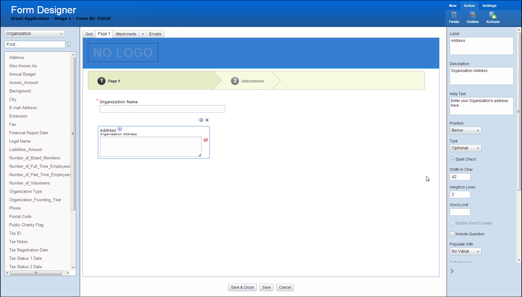
Understanding the Form Designer Layout
The Form Designer has three main sections:
-
Left Panel: Displays a list of the fields available to be added the current form. It is set to display an outline of the form or other elements. Details about changing this display are found in the menu options list.
-
Middle Panel: The main area for displaying and editing the form. Sections added here to group related fields together. Tabs on the top of the Middle Panel represent different pages in the form.
-
Right Panel: Used to edit the settings selected in the Left Panel.
Command Buttons
The form has Save, Save & Close, and Cancel buttons so you can save your changes.
Note: If the current form is active, your changes are not reflected in any currently in-progress applications.
Field Selection and Relocating
The fields in the Form Designer look similar to the ones shown below.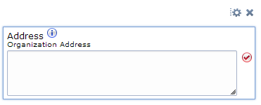
-
Edit (gear): Edits field properties by opening the right panel with associated settings.
-
Delete: Deletes a selected field.
-
Resize corner (lower right): Dragging the bottom right corner of the field allows users to resize fields to desired size.
-
Repositioning fields: You can position fields in desired locations on the form by dragging and dropping.
-
Help Text: If you add Help text to a field, this icon is displayed next to the field label.
-
Spell Check: When the spell check option is enabled on long text fields, this icon is displayed to the right of the field.
Forms Designer: Control Panels
Left Panel: Fields List
The left panel by default displays a list of the fields available for adding to your form.
If the panel is currently in Outline mode, you can change to Fields mode by selecting Actions > Fields in the ribbon menu.
The fields displayed are based on the category selected in the top menu.
Field Type Category Menu
Selecting a record type filters the list of available fields by that record type. Record types available are:
- Organization
- Organization Primary Contact
- Request
- Request Primary Contact
- Text
- Add Additional Contact
Find search box
Typing in this field filters the list of available fields by the entered text. If the field contains the text entered in the search box, it appears in the list of available fields. When this box is empty, all fields are available.
List of Available Fields
Displays the list of fields that are added to the form.
Left Panel: Outline View
Available via Actions > Outline.
This mode displays the form in its current state in a tree view.
The tree is presented in a Page/Group/Field hierarchy.
Clicking a field in the outline selects the field in the main window.
Using the Find function highlights the fields in the outline window where the field name contains the text entered in the find box.
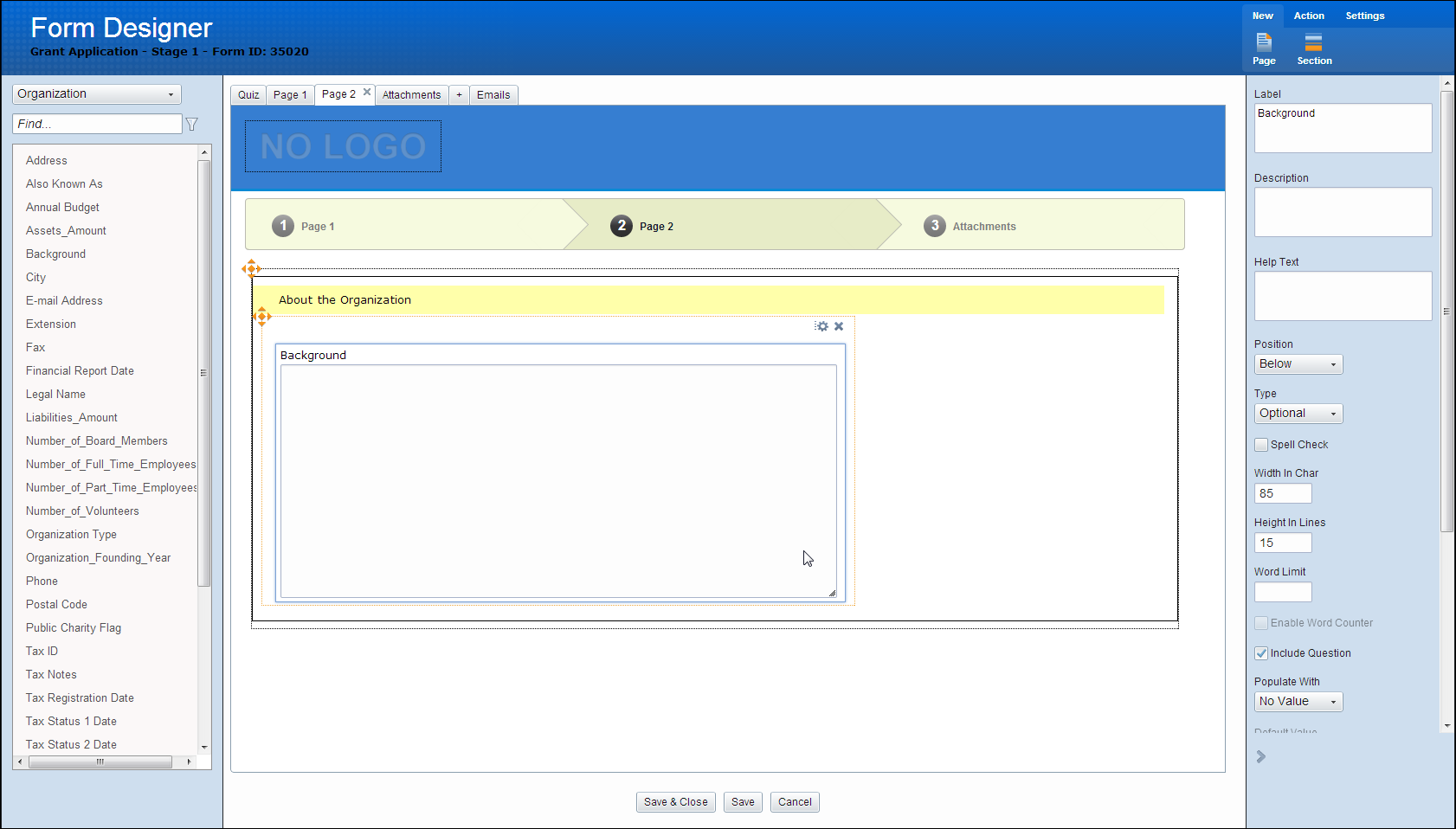
Right Panel: Field Settings
The right panel is typically used for setting field properties.
When a field is selected, the right panel displays the properties for that field.
This panel is closed/hidden via Close on the lower right. Once closed, an button appears on the right side that reopens the panel. Clicking the appropriate Edit icon for a field opens the panel.
Note: The right panel only displays when an element has been selected. If no element is selected, it is hidden.
Forms Designer: Editing Codes
When selecting a code field, the Edit Code button can be used to set coding options. The Code Properties appears as a modal window centered on the screen. The window contains the Coding Sheet - Code Table name as the header. The top of the window contains settings particular to this field. Two columns are displayed side by side below the settings, Available Codes and Displayed Codes.
The Available Codes section contains a Find filter and a list of fields that are displayed.
The find filter filters the selection of Available codes by the text entered. Double clicking on a field or dragging and dropping it adds the field to the Displayed Codes section. An icon is displayed to add all fields. The Displayed Codes section shows fields that are displayed on the Form. Each selection contains an icon to the right that allows the user to remove the field. An icon is displayed to remove all fields.
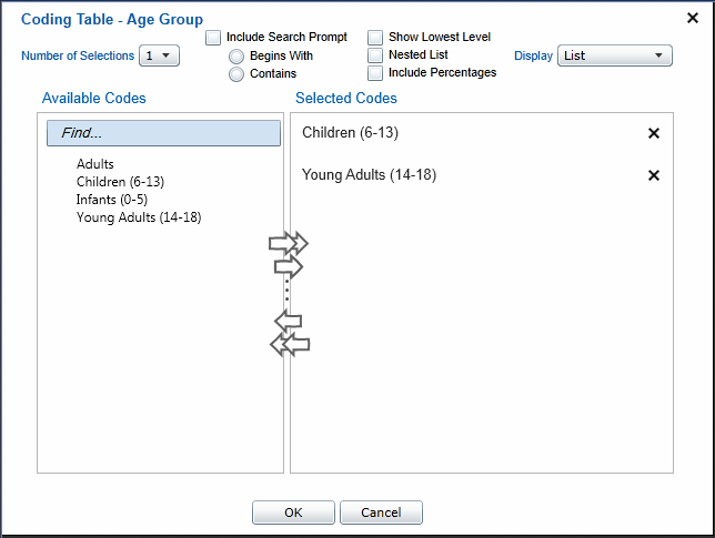
Show Lowest Level
If enabled, “Nested List” is automatically disabled.
Nested List
If enabled, “Show Lowest Level” is automatically disabled.
Include Percentages
If enabled, an additional numeric box, and “%” text appears next to each selection.
Forms Designer: Field Properties
Selecting a field or its label brings up the Field Properties in the Right Panel.
Double-clicking a label allows a user to edit the label text.
The Field Properties appears in the right panel on the screen. The window contains the field name and type as the header. The available field properties are dependent on the field type.
Date
- Label
- Description
- Help Text
- Minimum Value (Date)
- Maximum Value (Date)
- Populate With (No Value/Set Value) Set Value provides a date control or a check-box for Today’s Date
- Radio button selection for Optional (Default), Required, Read-Only, Hidden
- Require Verification check-box
- Verification Label
- Verification Description
Long Text
- Label
- Description
- Help Text
- Word Limit
- Enable Word Count
- Enable Spell Check
- Include Question in Grantmaking
- Populate With (No Value/Set Value) Set Value provides a text box
- Radio button selection for Optional (Default), Required, Read-Only, Hidden
- Require Verification check-box
- Verification Label
- Verification Description
Text
- Label
- Description
- Help Text
- Enable Spell Check
- Populate With (No Value/Set Value) Set Value provides a text box
- Radio button selection for Optional (Default), Required, Read-Only, Hidden
- Require Verification check-box
- Verification Label
- Verification Description
Attachment
- Label
- Description
- Help Text
- Word Limit
- Allowed File Types
- Radio button selection for Optional (Default), Required, Read-Only, Hidden
- Require Verification check-box
- Verification Label
- Verification Description
Number
- Label
- Description
- Help Text
- Minimum Value (Number)
- Maximum Value (Number)
- Populate With (No Value/Set Value) Set Value provides a text box
- Radio button selection for Optional (Default), Required, Read-Only, Hidden
- Require Verification check-box
- Verification Label
- Verification Description
Currency
- Label
- Description
- Help Text
- Minimum Value (Currency)
- Maximum Value (Currency)
- Display decimals separately
- Populate With (No Value/Set Value) Set Value provides a text box
- Radio button selection for Optional (Default), Required, Read-Only, Hidden
- Require Verification check-box
- Verification Label
- Verification Description
Checkbox
- Label
- Description
- Help Text
- Alignment (Above/Right)
- Populate With (No Value/Set Value) Set Value provides a text box
- Radio button selection for Optional (Default), Required, Read-Only, Hidden
- Require Verification check-box
- Verification Label
- Verification Description
Forms Designer: Labels and Fields
Adding a Field: To add fields, double-click on the field or drag the value from the left panel onto the form. Both the field and its label are added. By default, the label is positioned above the field and the field label is the name of the field with spaces replacing any underscores. Once added to the Form Editor, the field is no longer available to be selected (removed) from the left panel. The exception to this are items in the Text category (not fields, regular text), and long text fields.
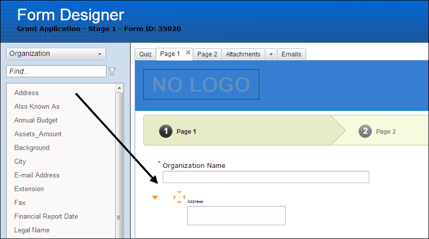
If a section is first selected, double-clicking a listed field adds the field to the bottom of that section. Otherwise, the field is added to the bottom of the page. When dragging and dropping, the field is added to the highlighted location where the field are dropped.
Field Selection: Any field in the Form Editor window is selected. Selecting the field highlights the label and field. Two icons appear alongside the field, one for Edit, and one for Delete. For coding fields, an additional icon/button/text (Edit Code) appears that allows for setting of coding options. Selecting a different field/element deselects the current field and selects the one clicked.
It is possible to edit more than one active field at the same time by holding down the CTRL key and clicking multiple elements. On the right panel, only properties shared by the selected elements (e.g. width) are shown.
Note: During the Duplicate Check step of the Consider process, if the User chooses to update an existing Organization record with data from the Application, the only Organization fields that update are those fields selected during the Duplicate Check process. No other fields automatically update.
Removing a Field: Each field has a Delete button that appears when the field is selected. Clicking the Delete button deletes both the field and its associated label.
Resizing Labels and Fields: When a field is selected an arrow icon appears on the lower right that allows you to resize the field. With the exception of text fields, resizing can only occur horizontally. Text fields are resized horizontally and vertically. It is not possible to resize a label. The label should automatically take up the width of the text within.
Moving Labels and Fields: Moving a label and field involves clicking on the field and dragging it to its new location. Dragging either the label or field moves both together.
Labels and fields are dragged and dropped to the following positions:
- Blank page
- Blank sections
- Above or below an existing field
- Above or below an existing section
- To the left or right of an existing field
In order to allow movement of a field to another page, upon dragging the field to the tab at the top of the Form Editor, the page for that tab displays.
If a page is scrollable in any direction, dragging a field and hovering over the edge of the page for more than 1 second scrolls the page in that direction.
Forms Designer: Logo/Header
When a new form is created, the header of the page displays the text ‘No Logo’.
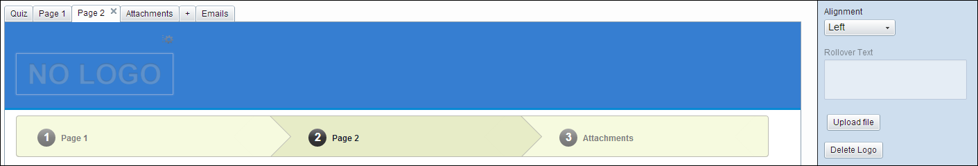
If selected, settings are shown in the right panel to Upload an image. Accepted file types are .jpg and .gif. Once a file is selected, the Form Editor displays the uploaded picture file and selects it.
Clicking on the logo selects the logo as described in Field Selection. Clicking the Edit Properties button displays the following settings in a right panel.
- Logo Path and File Name (Read-Only)
- Alignment [Left/Center/Right]
- Rollover Text
- Upload files button
- Delete Logo button
Clicking the Delete Logo button removes the picture file and displays a NO LOGO image in its place.
Forms Designer: Menu Options
The menu is presented in the style of the current Grantmaking application.
New
-
Page: Adds a new page to the form and displays the page. This is presented as a tab in the form designer.
Upon adding the page, the page is displayed and the page name is editable.
The page name and page position – are adjusted after the section is inserted.
Double clicking the tab name allows for editing the name.
Dragging and dropping allows for adjusting page order.
If more than one page is present, an X icon appears next to the page titles. This icon allows the user to remove the entire page. A confirmation is presented to you before allowing deletion. On hover over the X icon, a tooltip displays “Delete Page”.
-
Section: A section is a separation of fields that contains its own title and. This option adds an empty section to the bottom of the current page. This button is disabled if a section is already selected; a section cannot exist within another section.
Actions
-
Fields: Hides the Outline panel and displays the Fields panel.
-
Outline: Hides the list of available fields left panel and displays the Outline panel.
-
Activate/Deactivate: Before a form is actually accessed by users, it must be activated. Until then, the form is inactive and is not presented to users for data entry.
The Activate option should be hidden if the form is already active and the Deactivate option should be hidden if the form is already inactive.
Settings
-
Properties: Set various defaults for your new forms such as Title, Description, Language, and Authentication requirements here.
-
Links: Allows the editing of special links on the My Account pages.
-
Emails: Allows the editing of automated emails for Applications or Requirements.
-
Eligibility: Allows you to configure the Eligibility Quiz, if enabled, which is displayed before the application.
-
Attachment: Allows the editing of the Attachments page, if enabled.
-
Design: Allows the editing on various layout aspects such as background, accent colors, and tab colors.
-
Text: Allow the editing of various aspects of text displayed including font, size, and color.
-
Messages: Allows the editing of default system messages such as Invalid Password or Successful Submission.
Forms Designer: Navigation Bar Settings
Form navigation is shown underneath the logo (Chevron or Classic Tabs).
While in Form Editor mode, the links in the navigation cannot be clicked. Clicking the navigation selects the element without the Delete button.
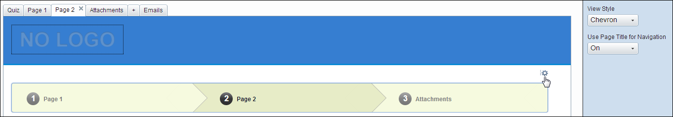
Clicking the Edit button displays the following settings in the right panel:
-
View Style [Chevron/Classic]
-
Use Page Title for Navigation [On/Off]
When this option is Off, navigation displays “Page 1, Page 2” etc. instead of the name of the page. When On, the navigation uses the name of the page instead.
Min 1 char, Max 100 chars
Navigation Styles
-
Classic: Displays page navigation in a table as links.

-
Chevron: Displays navigation in a table separated by number and arrow images.

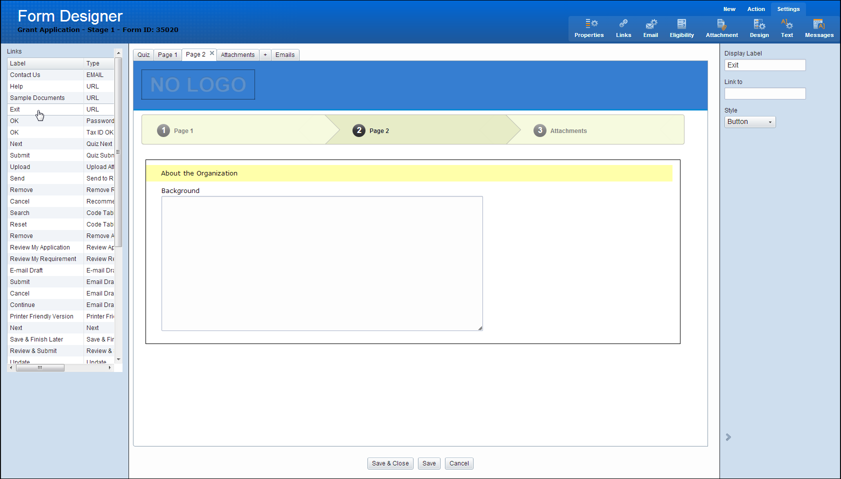
Forms Designer: Sections
This section discusses the Forms designer sections.
Clicking on a section of a form selects and highlights the entire section, inclusive of the fields contained. The Right Panel opens and display the section properties.
Clicking the Section label allows for editing of the label. Edit and Delete buttons are displayed when the section is selected.
Clicking Edit either hides the right panel (if it’s open already) or shows it (if it was hidden).
It is possible to move an entire section via drag and drop. Once moved, any fields contained within the section are moved along with it.
The Right Panel shows the following Section options:
- Label
- Title Color
- Title Background Color
- Group Background Color
- Border Color
- Border Width
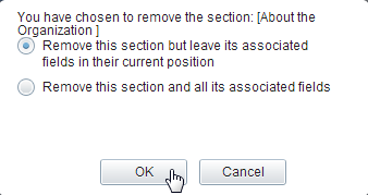
Clicking the Delete button presents the following prompt:
Settings Menu
The Settings menu in the Forms Designer gives you access to various configuration options for your forms.
Note: Any changes made to the settings are displayed in the Form Editor.
Note: Settings: Outcomes
Settings: Properties
- Form Title
- Description
- Form Language/Spell Check Language
- Form Type (Application, Scholarship, or Requirement)
- Stage (and Associated Stage 1 if Stage 2 is selected), Enabled if Form Type=Application
- Site ID (For Multi-SID)
- Branch
- Suppress Organization fields from application form
- Authentication
- Require password to access form
- Require Account Login (default On)
- Populate Organization and Contact data from last Submission (default On)
- Require applicants to enter a U.S. Tax ID
- Require Tax ID to be on file in the IRS database
- Additional Contacts
- Organization Primary Contact is required
- Request Primary Contact is required
- Add (Action, creates a pop up window that creates an additional Contact type)
- Edit
- Remove
Settings: Links
Allows the editing of special links on the page.
By default, a new form does not have any links.
The links available to edit are predetermined.
To add a link, add the URL to the Link To setting.
The Left Panel lists of the various links on the page. Clicking on the link type highlights and selects the link (or the position of where the link would appear in its default position) and opens the link properties. If the link is on a different page than what is currently shown in the Form Editor, the page is switched to the one where the link resides and the link is selected.
Links cannot be dragged and dropped.
When a link is selected, the properties of the link are displayed on the right panel.
Available options for the link are:
- Display Label
- Link To
- Style
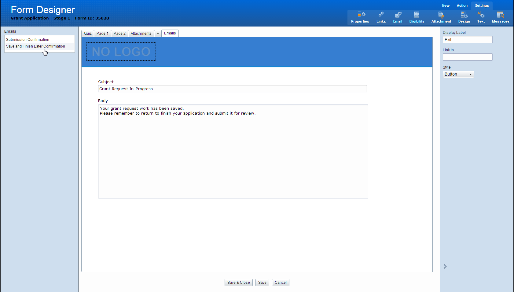
Settings: Email
Allows the editing of automated emails for Applications or Requirements.
The Left Panel displays the list of automated emails that are edited. Once selected, the form editor displays the message in an editable text box.
A button is included that allows the user to add merge fields.
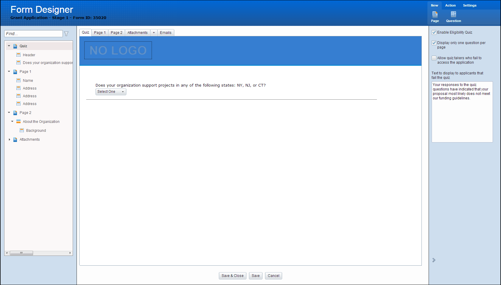
Settings: Eligibility
The Eligibility Quiz, if enabled, is displayed before the application.
Once clicked, the right panel displays Quiz Settings. Once “Enable Eligibility Quiz” check-box is checked, the Quiz page is added as a tab, and is available in the Outline View.
The Quiz is not shown in the navigation bar in the main panel.
The quiz page is always set as the first tab, and cannot be moved.
Quiz Menu Actions
New
- New Page - Add a new quiz page
- Add Question - Adds a new question to the Form Editor and selects it.
Questions are displayed in the main section. Questions are dragged and dropped above or below each other using the same logic as dragging and dropping fields (without the ability to drop to the right)- and moves the entire Question and associated Answers. Selecting a question highlights it and displays an Show Properties and Remove button.
Once a question is selected, the right panel displays the Edit Question Properties.
Right Panel Quiz Settings
Quiz Settings are shown in right panel anytime there is no question selected in the Quiz main panel. shown when Settings>Quiz is selected in menu.
Enable Eligibility Quiz: Checking this box creates a new page with different available actions than a normal page. Anytime this special page is selected, the Quiz settings are shown in place of the fields list. Fields cannot be added/moved to this page
Display only one question per page: Checking this box adds a page separator between questions. This is represented by a dotted line between questions
Allow quiz takers who fail to access this application: selecting this box allows applicants who failed the eligibility quiz to still access the application.
Text to display to applicants that fail the quiz: Default text is shown below.
Your responses to the quiz questions have indicated that your proposal most likely does not meet our funding guidelines.
Settings: Attachments
Accessible via Settings>Attachments in top ribbon menu.
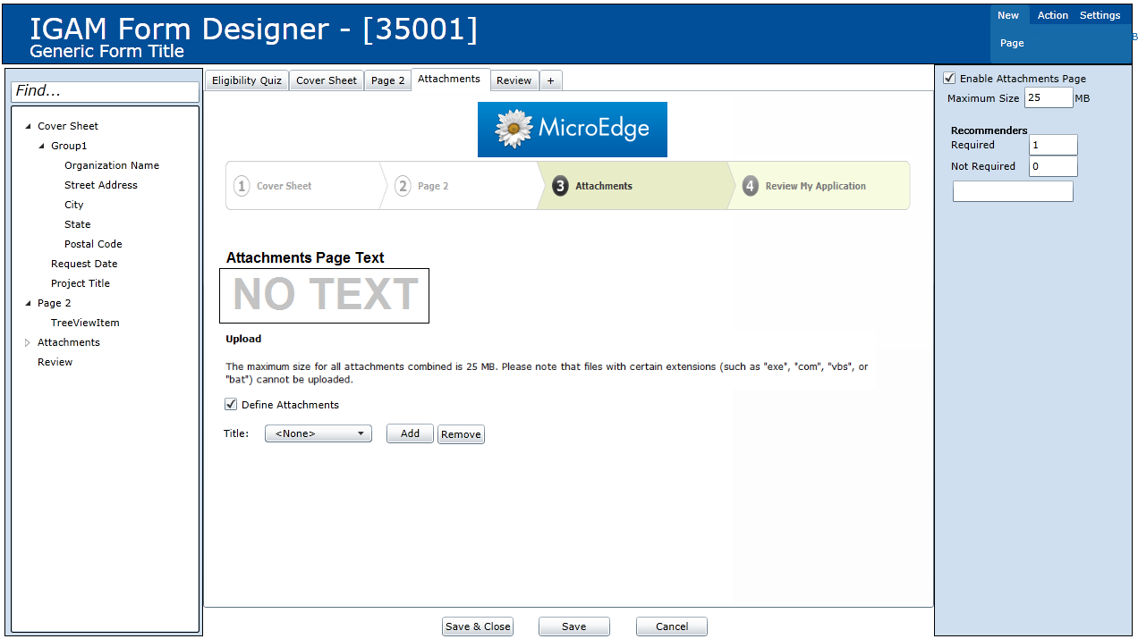
Once clicked, the right panel displays Attachment Settings.
Once “Enable Attachment Page” check-box is checked, the Attachments page is added as a tab and is available in the Outline View.
The attachment page is always set as the last page, and cannot be moved.
Main Edit Window
Attachments page text is a selectable element. On initialize, it displays NO TEXT. When selected, Attachment Page Text right panel is displayed.
Upload Text
Displays the following:
- Upload
The maximum size for all attachments combined is <Maximum Size> MB.
Note: Files with certain extensions (such as “exe’, “com”, “vbs”, or “bat”) cannot be uploaded.
Define Attachments Checkbox
When checked, the drop-down box, Add, and Remove buttons are enabled.
Defined Attachments List
drop-down box of defined attachments. To add an attachment, click on the Add button. To Edit an attachment, select the attachment by selecting it in the drop-down box. To remove an attachment, select the attachment in the drop-down box and click remove. A confirmation message should display “Do you want to remove <Attachment Name>?” OK/Cancel
Adding or selecting a defined attachment displays the Defined Attachment Properties right panel.
Right Panel
Attachment settings is shown in right panel anytime there is no active selected element in the Attachments main panel. shown when Settings>Attachments is selected in menu.
Enable Attachments Page:
Checking this box creates a new page with different available actions than a normal page. Anytime this special page is selected, the Attachment settings are shown in place of the fields list. Fields cannot be added/moved to this page.
Maximum Size:
Enter the maximum size allowed for the attachment in megabytes(mb).
Recommenders (Only enabled if a blind attachment is added to the attachments list)
- # Required
- # Not Required
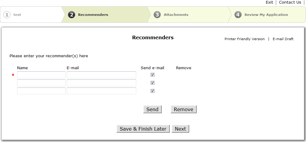
Adding a recommender in either the Required or Not Required box adds a Recommenders Page to the Form Editor.
Example of recommenders page with 1 required, 2 not required set:
Attachment Page Text
[Textbox] When the attachment page text element is selected in main panel, a text box is displayed in the right panel. Changes to this text box replaces the text in Attachment Page Text in main panel.
Defined Attachment Properties
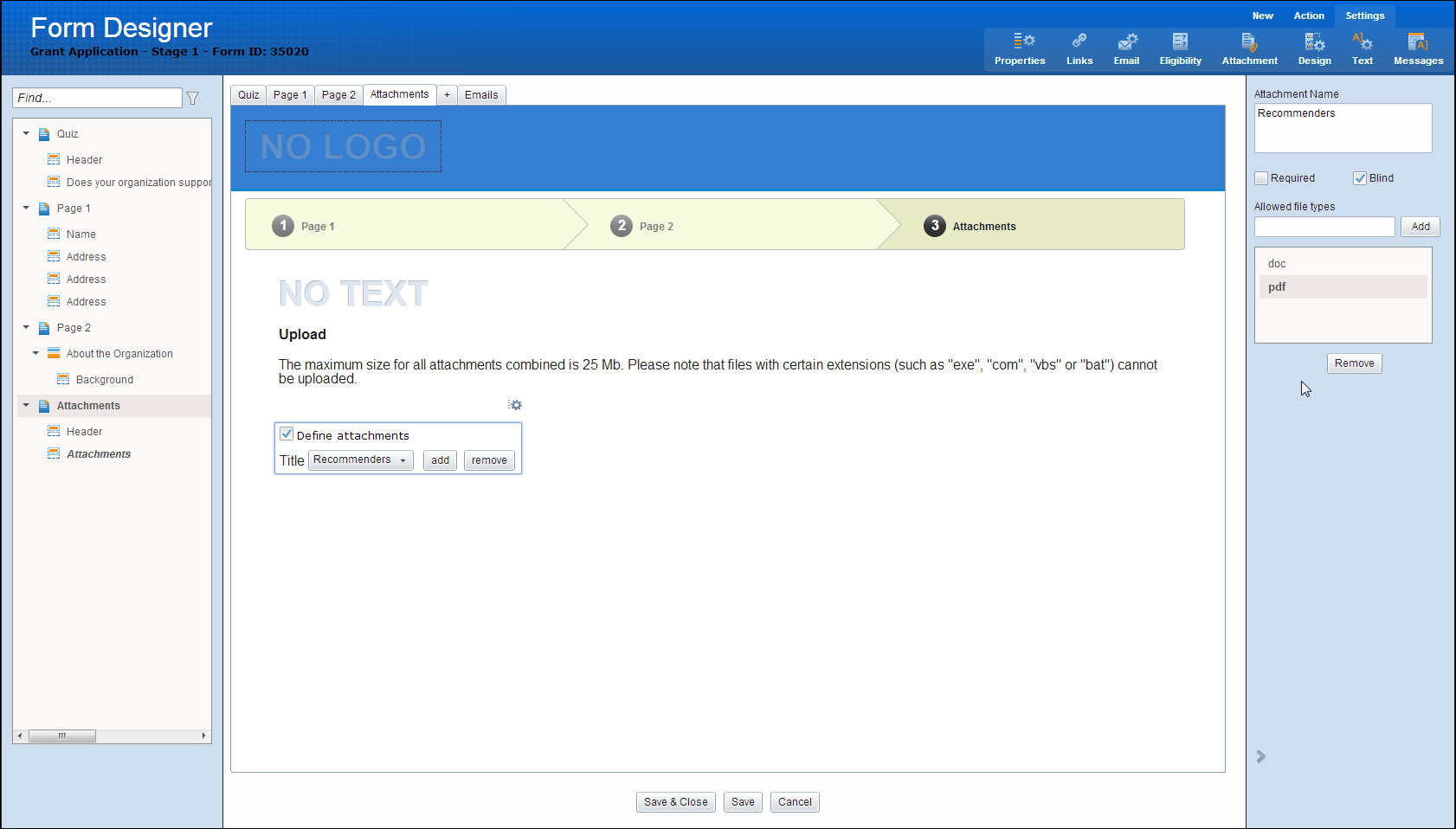
When clicking Add in the defined attachments list on the main panel, the right panel displays the options for adding the attachment. The same panel displays options to edit an existing defined attachment when the drop-down element is selected, and displays the element selected in the drop-down box.
[Textbox] Attachment Name
- Populates the drop-down box
[Checkbox] Required
- When checked, option in drop-down box displays (Required) next to the name
[Checkbox] Blind
- When checked, option in drop-down box displays (Required) next to the name
[Textbox][Add Button] File Type
- Allows the user to type in a file type and click Add or press enter to add to the File Type List
[Listbox] [Edit Button] [Remove Button]List of Allows File Types
- Listing of File Types added
- File types editable by double clicking in list or selecting the file type in list and clicking edit
- File types deletable by selecting file type in list and clicking delete
Settings: Design
This menu option allows you to configure the following:
Layout
- [Radio Button] Horizontal Accent
- [Radio Button] Vertical Accent
- [Checkbox] Include Content Frame
- Page Span [Entire Page/Left, Fixed Width/Right, Fixed Width] [Page Width: Pixels]
- Background File [Browse][Remove]
- HTML
- Header [Browse][Remove]
- Left Panel [Browse][Remove]
- Right Panel [Browse][Remove]
- Footer [Browse][Remove]
Colors
- [Color Picker] Header Background
- [Color Picker] Accent Bar
- [Color Picker] Body Background
- [Color Picker] Search Background
- [Color Picker] Active Tab Background
- [Color Picker] Inactive Tab Background
- [Color Picker] Button Color
Required Field Icon
- Icon
- Color
Settings: Text
This menu option allows you to configure the following:
Selecting the Text Display Element highlights the affected text in the Form Editor.
Display Element
- Form Title
- Page Title
- Header
- Notes
- Question Label
- Question Description
- Question Value
- Error Message
- Highlighted
- Navigation Active
- Navigation Inactive
- Button
- Icon
- Color
Font [List of Fonts]
- Size
- Alignment
- Bold
- Italic
- Color
- Required Fields
Settings: Outcomes
Enable Outcomes enables the Launch Outcomes button. Select Launch Outcomes to