Portal settings
Use portal settings to align Blackbaud Grantmaking with your organization’s branding and global preferences. From Client Settings, you can manage colors, supported languages and currencies, and the logo used across the portal, emails, and applicant-facing experiences.
Choose your color scheme
Configure your color palette so buttons, notifications, emails, and charts reflect your organization’s branding.
-
Navigate to the Settings > Client Settings area.
-
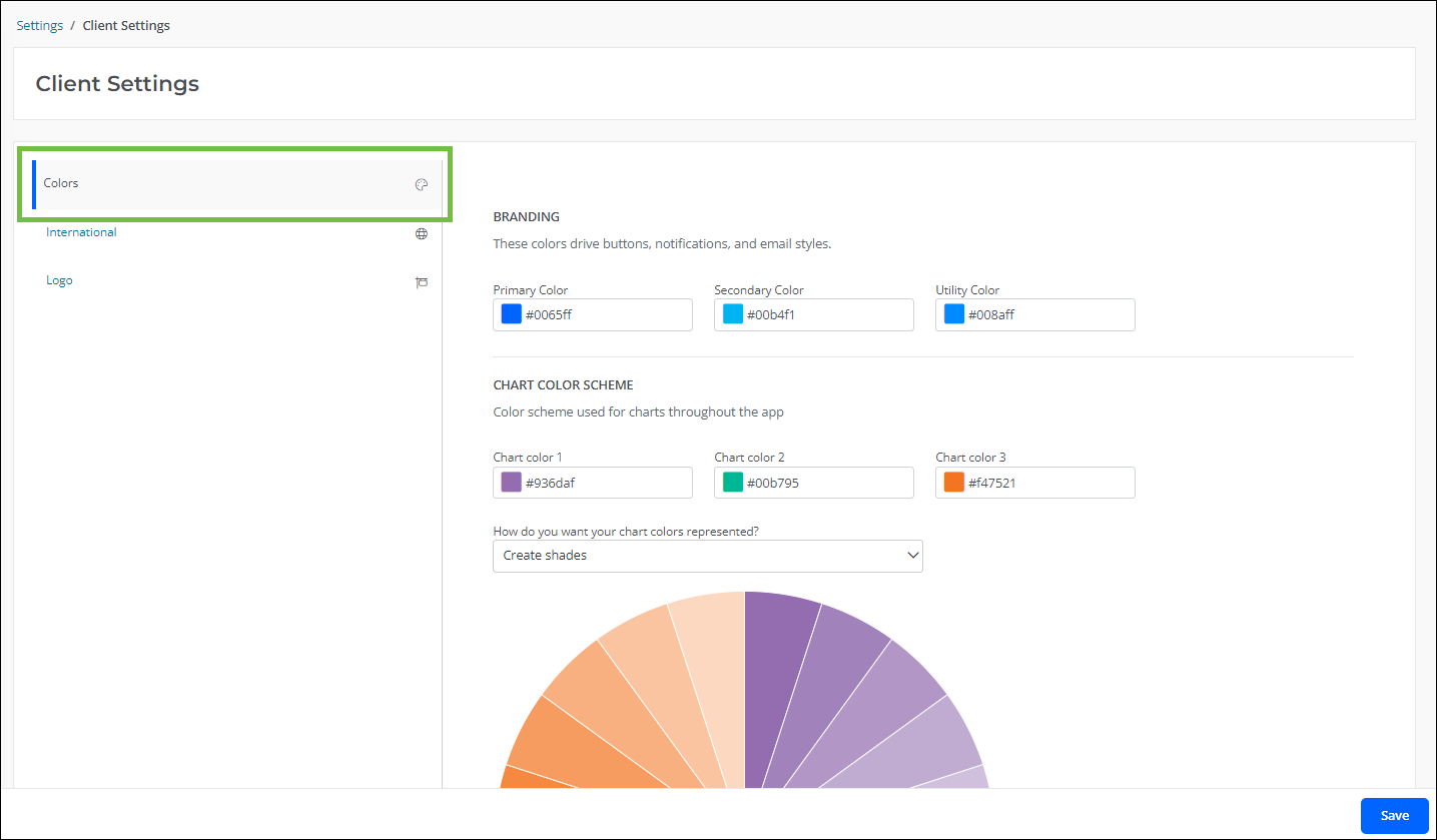
Select the Colors tab.
-
In the Branding section, specify the colors (i.e. Primary Color, Secondary Color, and Utility Color) to use for buttons, notifications, and email styling.
Note: Colors are automatically checked against accessibility standards. If the color does not pass these standards, then an alternate color will be suggested.
-
In the Chart Color Scheme section, specify the color scheme to be applied to charts in areas like dashboards. Options include shades, standard palettes, and alternate palettes.
-
Save all changes.
Select languages and currencies
Select the languages and currencies your organization supports so applicants and staff can work in the appropriate regional settings.
Tip: For the full supported list, see supported languages, supported currencies, and the broader International FAQ.
-
Navigate to the Settings > Client Settings area.
-
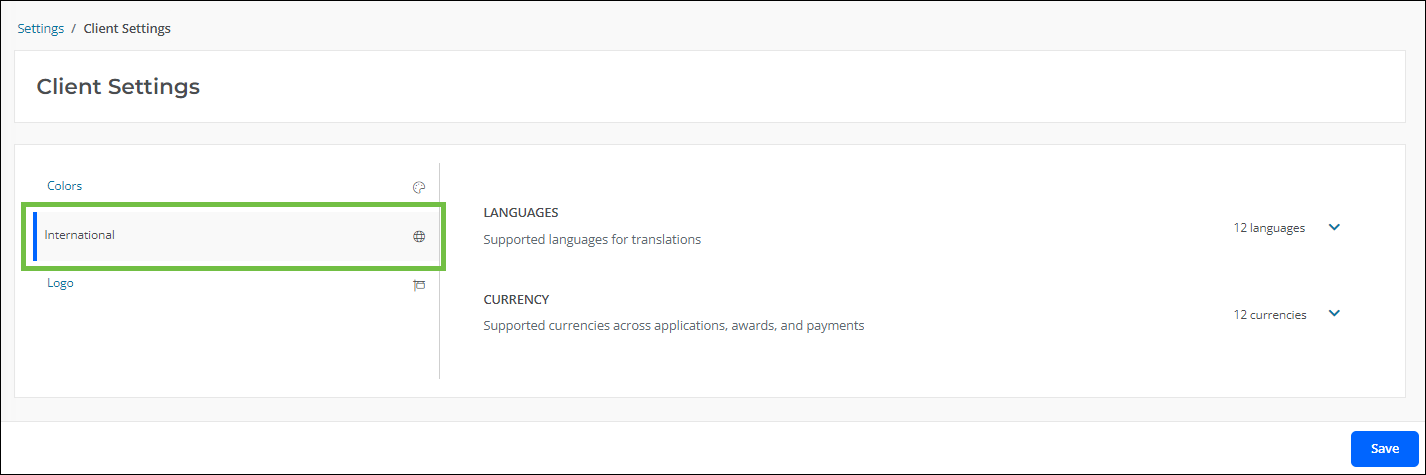
Select the Internationaltab.
-
Select the languages and currencies to be used.
-
Save all changes.
Upload your logo
Upload your organization’s logo to extend branding across Blackbaud Grantmaking, email communications, and external forms.
-
Navigate to the Settings > Client Settings area.
-
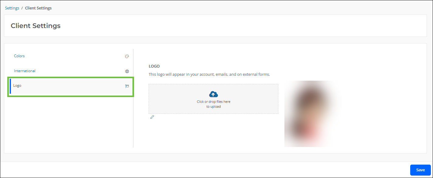
Select the Logotab.
-
Upload your organization's logo.
Note: The following file types are accepted:
WEBP,TIF,TIFF,SVG,BMP,GIF,JPG,JPEG, andPNG. -
Save all changes.
Supported Languages and Currencies
For current language and currency availability, review supported languages, supported currencies, and the full International FAQ.
Where Client Setting Colors Are Used
The colors selected in Colors > Branding are applied across key parts of the product experience.
-
Primary Color is used for button styling.
-
Secondary Color is used for notifications.
-
Utility Color is used for email styling and general Blackbaud Grantmaking styling.