Tables organize your content. You can design a table to structure the layout of content in your page before you add the content. You can also use tables to present tabular data -- information ordered in rows and columns. With a comprehensive set of table feature buttons, the WYSIWYG content editor supports both uses for tables.
For information about editing an existing table, refer to Editing a Table.
To create a table:
-
Place the cursor on your page where you want to add the table.
-
Select
 , Insert a new table. The Insert Table window opens:
 Cols – how many columns the table will have. (You can add or delete later.)
Rows – how many rows the table will have. (You can insert or remove rows later.)
Cellpadding – how much space (by default in pixels) should separate the content from the inside wall of each cell.
Cellspacing – how much space (by default in pixels) should separate the cells from each other.
Alignment – select on the down arrow to select an alignment — Center, Left, or Right — or leave as default (Not Set). Default is left aligned (or aligned with other content on the page) and, like Center, does not allow text to wrap around the table. Choosing left or right aligned will allow wrapping).
Border – how thick (by default in pixels) the lines demarcating the table and cells should be.
Width – width of the table, by default in pixels (although may be entered as any accepted value – em, %, in, mm, and so forth).
Height – height of the table, by default in pixels (although may be entered as any accepted value – em, %, in, mm, and so forth).
Class - select on the down arrow to select a class (from among those you have defined in CustomWysiwygStyle.css), leave as default (Not Set), or choose (value) to enter the name of a Cascading Style Sheet class defined in a file other than CustomWysiwygStyle.css.
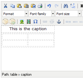
Table Caption – select the checkbox to insert the HTML caption tag set at the correct position inside the table. You can enter a value after you select Insert and are returned to the editor. The topmost row of your new table will be a single cell. You have to type the value into that cell. You can be sure you are in the caption cell by noting the document path at the bottom of the editor: Path: table >> caption.
- Make choices for the following options under the Advanced tab:
Id – a unique name that identifies the table as an object embedded in the page.
Summary –used only for data tables, not for layout. This field describes the structure of the table (for example, “Two columns with seven rows.”) and the content (for example, “The first column is for fonts, the second column is for examples of those fonts.”).
Style – this is a Cascading Style Sheet style to apply to the table.
Language Code – this is a definition of the language (and font type) used in the table. For example, enter en-GB to indicate English used in Great Britain.
Background image – image to serve as the background for the entire table. Even if you are using an image from your image library, you will need to type (or paste) in an absolute path, such as http://bvt101.convio.com/images/content/pagebuilder/maui.jpg.
void – no outer border (but inner cell borders remain)
above – only a top border (no inner cell borders and no outer side and top borders)
below – only a border at the bottom of the (no inner cell borders and no outer side and top borders)
hsides – only borders at the top and bottom (no inner cell borders and no outer side borders)
lhs – only a border on the left hand side
rhs – only a border on the right hand side
vsides – only borders on the left and right sides
box – only an outer border (all the way around), with no inner cell borders
border – same as box
none – no lines
groups – lines between row groups and column groups
rows – lines between rows
cols – lines between columns
all – lines between rows and columns
Language direction – specifies the direction for the characters. Left to right is default behavior for English and other Western languages. Right to left reverses the letter or character flow; it creates a mirror image effect with English.
Select a color to select it. Select Apply.
- The tool works exactly the same as the Border color selector, above.
Frame – this sets which outer borders of the table are visible.
Rules – this specifies which inner borders in a table are visible:
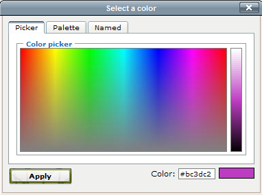
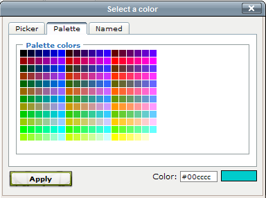
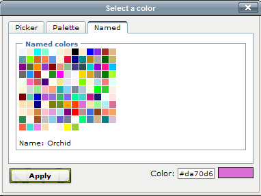
Border color – the color of all displayed borders, inner and outer. Can be specified with a named color, such as “red”, or in hexadecimal or rgb color, such as “#ff0000.” The tool to the right of the input opens a color selector:
The color selector has three panes, each with a different interface, for choosing a color:
Background color – the color of all displayed borders, inner and outer. Can be specified with a named color, such as “red”, or in hexadecimal or rgb color, such as “#ff0000.” The tool to the right of the input opens a color selector:
-
Select Insert when you have finished defining the table.
-
Place your cursor in a cell to enter content. Content may be text, images, links, or any other WYSIWYG content editor supported content.
Make choices for the following options under the General tab: