Viewing the Email Analysis Report
Note: The Email Tracking and Email Analysis reports rely on data from Email Classic which has been deprecated.
The Email Analysis Report displays in the Report Viewer with the:
Report Date timestamp that shows when the report was generated
Analysis Dimension selected for the report (that is, State/City/Zip, Donor Status, or Advocacy Status)
Drill-Down Level, which is listed as State, Donor Status, or Advocacy Status
Filter Criteria (not applicable)
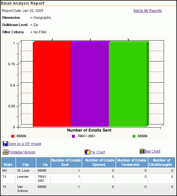
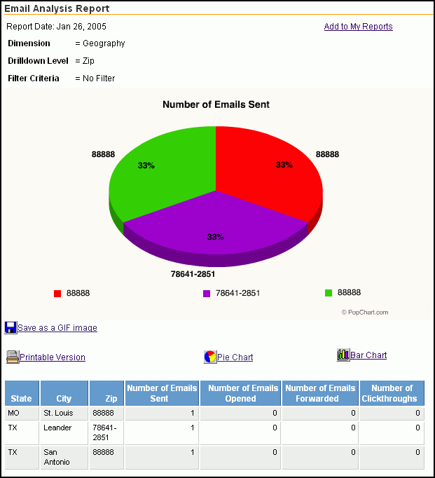
Pie Chart that shows all values for the Number of Emails Sent metric
Table that contains columns for the criteria selected for the Analysis Dimension and each metric that is collected
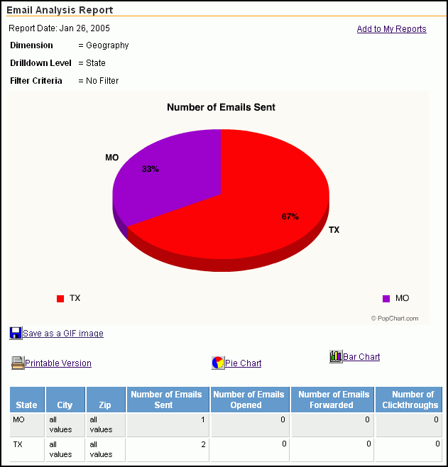
The first set of table columns correspond to the selected Analysis Dimension (geographical, donor status, or advocate status). Clicking the heading on one of these columns expands the data shown in the table and redraws the chart with the expanded information.
For example, if you click the City column heading, the system replaces the all values default row with new rows that list each city in which there were residents who were sent email and redraws the chart with the corresponding graphical breakdown of this information.
For reports generated with the Analysis Dimension as Analyze by:
State/City/Zip,you can click the City and Zip columns (second and third columns) to drill down further into the details of emails sent to specific areas
Donor Status, you can click the Donor Status and Donor Group columns (first and second columns) to drill down further to compare the number of emails sent to users who made online donations with the number of emails sent to users who did not make donations
Advocacy Status, you can click the Advocacy Status and Advocacy Group columns (first and second columns) to drill down further to compare the number of emails sent to users who responded to alerts with the number of emails sent to users who did not respond to alerts
The remaining table columns list the possible metrics (Number of Emails Opened or Forwarded, and Number of Clickthroughs). When you click one of these column headings, the system will redraw the chart with the information for that metric. For example, clicking the Number of Clickthroughs table heading causes the system to redraw the chart to show the number of times users who opened the emails clicked through to the Web site.
You can also change the chart format from the default pie chart by clicking the Bar Chart icon and link.