Interaction Analysis Report Results
The Interaction Analysis report displays in the Report Viewer with the report label across the top and the report date time stamp immediately below it. If you have not entered a label, the system uses the report name (List Performance Report).
The columns are explained below. Click here to view a sample of this report in a separate window.
Report Date time stamp that shows when the report was generated
Analysis Dimension selected for the report (that is, Country/State/City/Zip, Donor Status, or Advocacy Status)
Drill-down Level, which is set to the value of the first report of the column (that is, Country, Donor Status, or Advocacy Status)
Filter Criteria, which is unused at this time
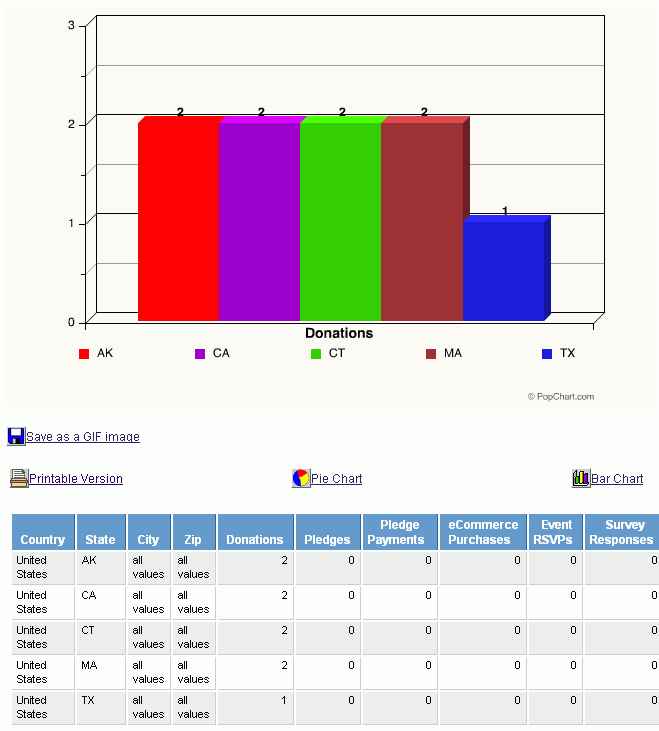
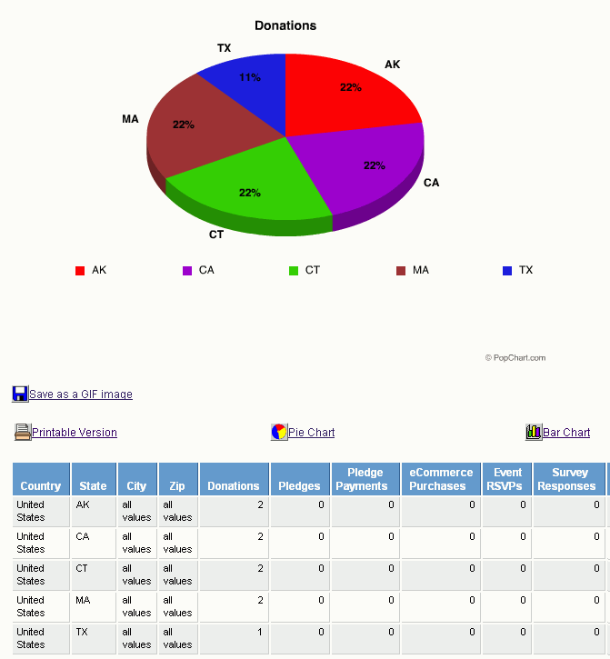
Pie Chart that shows all values for the Donations interaction
Table that contains columns for the criteria selected for the Analysis Dimension and each possible interaction
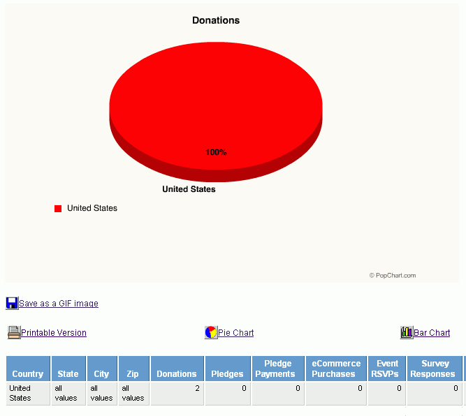
The first set of table columns correspond to the selected Analysis Dimension (geographical, donor status, or advocate status). Clicking the heading on one of these columns expands the data shown in the table and redraws the chart with the expanded information.
For example, if you click the State column heading, the system replaces the all values default row with new rows that list each state in which there were residents who interacted with your site and redraws the chart with the corresponding graphical breakdown of this information.
For reports generated with the Analysis Dimension as Analyze by:
Country/State/City/Zip, you can click the State, City, and Zip columns (second, third, and fourth columns) to drill down further into the details of interactions made in specific areas
Donor Status, you can click the Donor Status and Donor Group columns (first and second columns) to drill down further to compare the number of interactions made by the users who made donations and may have performed other interactions versus the users who did not make donations but did interact in other ways
Advocacy Status, you can click the Advocacy Status and Advocacy Group columns (first and second columns) to drill down further to compare the number of interactions made by the users who responded to alerts by sending them and also may have performed other interactions versus the users who did not respond to the alert but did interact in other ways.
The remaining table columns list the possible interactions that constituents and site visitors may perform. When you click an interaction column heading, the system will redraw the chart with the information for that interaction. For example, clicking the Event RSVPs table heading causes the system to redraw the chart to show the number of users who registered for RSVP events.
You can also change the chart format from the default pie chart by clicking the Bar Chart icon and link.